Every app needs it: A settings page. This tutorial explains how to create a settings page with flutter easily by using the library cupertino_setting_control.
Cupertino Setting Control supports multiple input methods (e.g. dropdown, textfield etc.) as well as multiple configuration options concerning look and feel (e.g. where the title shall be displayed) and style options (e.g. font size and color).
Usage of Cupertino Setting Control Flutter Library
Luckily, cupertino_setting_control makes it easy to build your settings page with flutter. It helps you to create very customizable setting rows which together build your setting page.
SettingRow(
  rowData: SettingsTextFieldConfig(
    title: 'Name',
    initialValue: 'Chris',
  ),
  config: SettingsRowConfiguration(),
  style: SettingsRowStyle(),
  onSettingDataRowChange: (resultVal) {}
)
rowData defines the input/setting type with its initial data (see chapter Input Methods / Setting Control Types).
config contains configuration options for the setting row, e.g. where the title shall be displayed (see chapter Setting Control Configurations).
style defines the style of the setting row, e.g. the font color (see chapter Setting Control Style)
onSettingDataRowChange is called if the user has made some input.
Setting Control Configurations
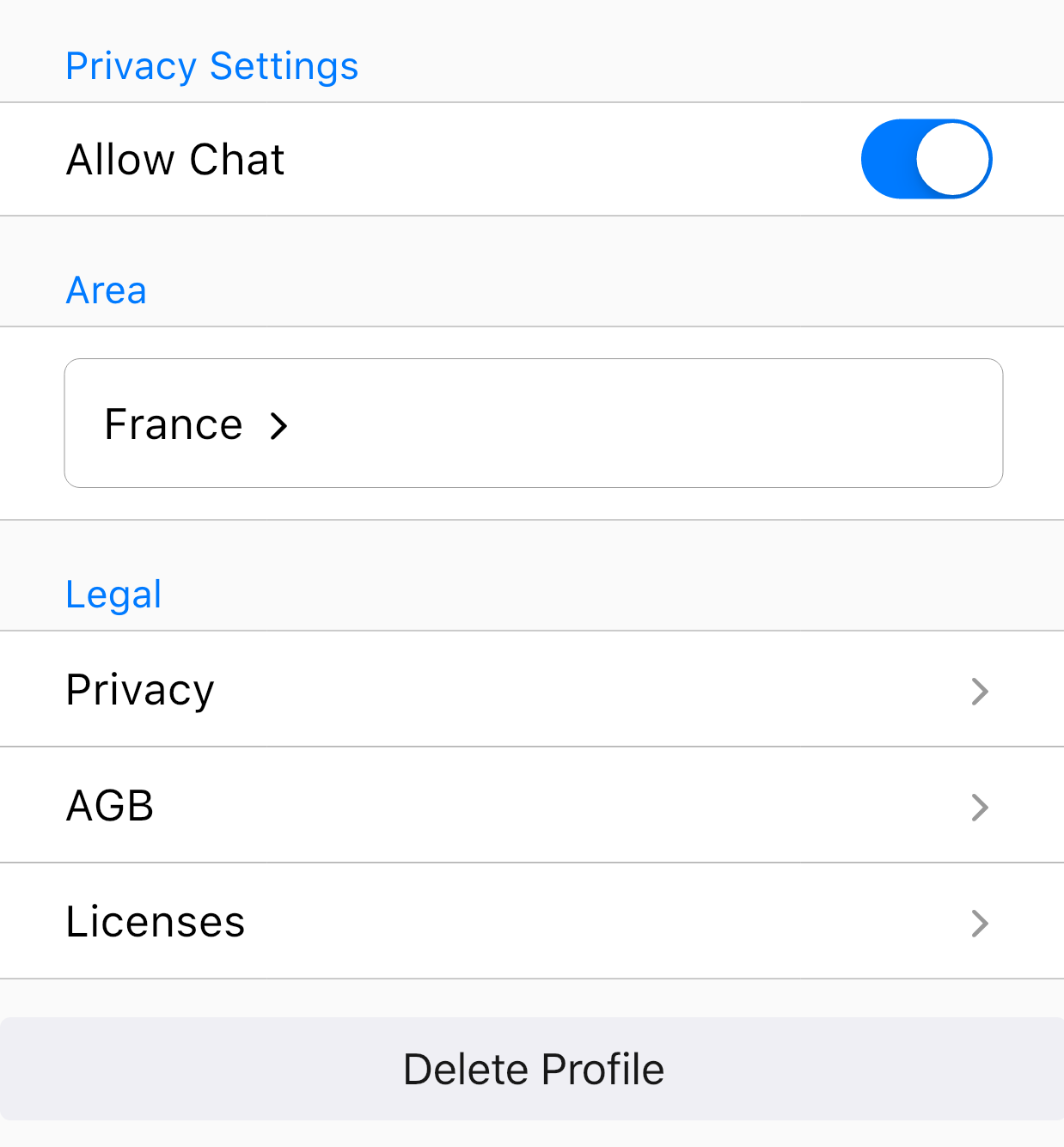
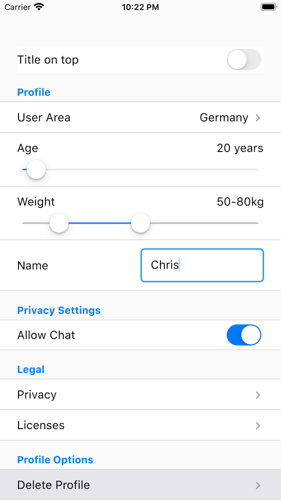
Cupertino_setting_control has multiple configuration options. In my opinion, the most important configuration toggles are showTitleLeft and showTopTitle: These toggle the visibility of the title. These can be activated together, separate or not at all.
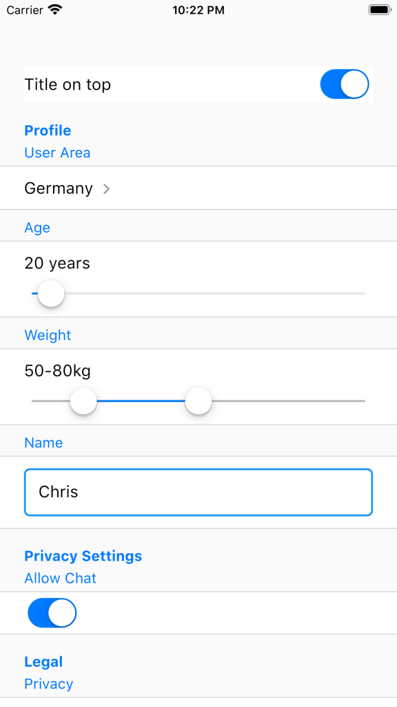
(showTitleLeft = false, showTopTitle = true)
In addition, it is possible to display setting controls as TextFields. This can be done with the option showAsTextField. Displaying setting controls as text fields makes sense if you want to use the setting control library for e.g. a form. Anyhow, here it might also make sense to activate showAsSingleSetting in order to get rid of the borders.
(showAsTextField = true, showAsSingleSetting = true)
All in all, here is a short summary of SettingsRowConfiguration.
class SettingsRowConfiguration {
  /// If true, the title will be displayed on top of the configurable setting widget (e.g. drop down)
  final bool showTopTitle;

  /// If true, the title will be displayed in the same line and left to the configurable setting widget
  final bool showTitleLeft;

  /// If true, the configurable setting widget will be displayed as text field widget (a border around the widget)
  /// This makes sense e.g. for drop down widgets which shall be displayed as a text field
  final bool showAsTextField;

  /// Will remove the border on top and bottom of the setting control. This makes sense if you want to use the widget in e.g. a form.
  final bool showAsSingleSetting;
}
Input Methods / Setting Control Types
Slider Input
This setting control type displays a Slider which is used to select a number value out of a given range.
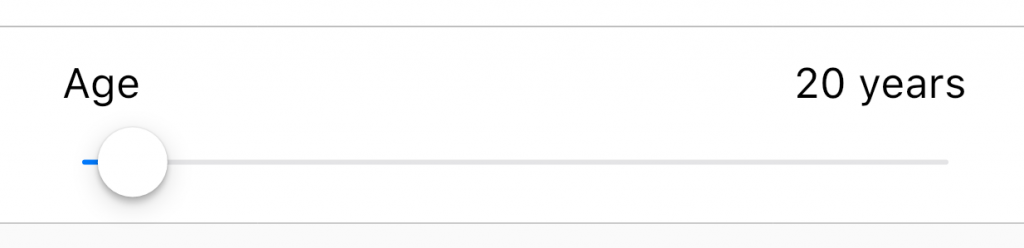
SettingRow(
  rowData: SettingsSliderConfig(
    title: 'Age',
    from: 18,
    to: 120,
    initialValue: 20,
    justIntValues: true,
    unit: ' years',
  ),
  onSettingDataRowChange: (double resultVal) {},
  config: const SettingsRowConfiguration(
      showAsTextField: false,
      showTitleLeft: true,
      showTopTitle: false,
      showAsSingleSetting: false),
),
Slider Range Input
This setting control type displays a Slider.
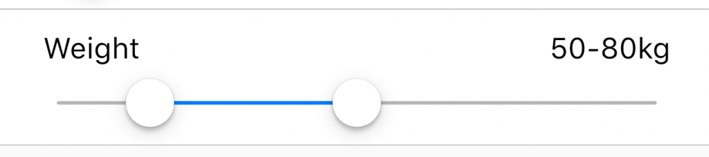
SettingRow(
  rowData: SettingsSliderFromToConfig(
    title: 'Weight',
    from: 40,
    to: 120,
    initialFrom: 50,
    initialTo: 80,
    justIntValues: true,
    unit: 'kg',
  ),
  onSettingDataRowChange: (List<double> resultVals) {},
  config: const SettingsRowConfiguration(
      showAsTextField: false,
      showTitleLeft: true,
      showTopTitle: false,
      showAsSingleSetting: false),
),
Yes-No, Boolean, Switch Input
This setting control type displays a switch.
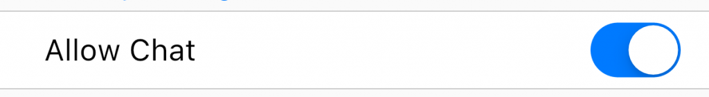
SettingRow(
  rowData: SettingsYesNoConfig(
      initialValue: true, title: 'Allow Chat'),
  onSettingDataRowChange: (result) {},
),
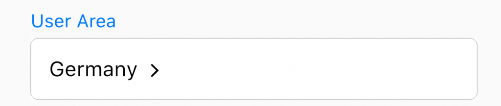
DropDown Input
This setting control type displays a drop down which will be opened if the drop down result is clicked (e.g. France here).
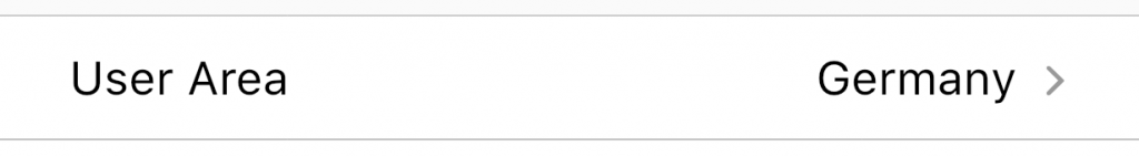
SettingRow(
  rowData: SettingsDropDownConfig(
      title: 'User Area',
      initialKey: _searchAreaResult,
      choices: {
        'Germany': 'Germany',
        'Spain': 'Spain',
        'France': 'France'
      }),
  onSettingDataRowChange: onSearchAreaChange,
  config: const SettingsRowConfiguration(
      showAsTextField: false,
      showTitleLeft: true,
      showAsSingleSetting: false)
Text Field Input
This setting control displays a text field which can be used to enter some text.
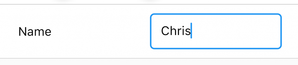
SettingRow(
  rowData: SettingsTextFieldConfig(
    title: 'Name',
    initialValue: 'Chris',
  ),
  onSettingDataRowChange: (String resultVal) {},
  config: const SettingsRowConfiguration(
      showAsTextField: false,
      showTitleLeft: true,
      showTopTitle: false,
      showAsSingleSetting: false),
)
Button Input
This setting control displays a button which will execute a given method if clicked.
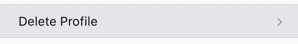
SettingRow(
  rowData: SettingsButtonConfig(
    title: 'Delete Profile',
    tick: true,
    functionToCall: () {},
  ),
  style: const SettingsRowStyle(backgroundColor: CupertinoColors.lightBackgroundGray),
  config: const SettingsRowConfiguration(
      showAsTextField: false,
      showTitleLeft: true,
      showTopTitle: false,
      showAsSingleSetting: false),
)
URL Setting
This setting control simply displays the title and opens a link if clicked.
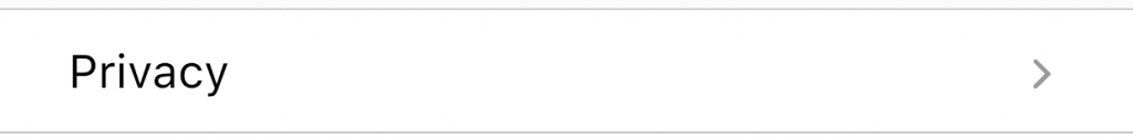
SettingRow(
    rowData: SettingsURLConfig(
        title: 'Privacy',
        url: 'https://yourprivacystuff.notexistant'))
Setting Control Style
A SettingRow has multiple style options. You can use those to adjust the SettingRow to match your UI/UX.
class SettingsRowStyle {
  /// Every padding will be removed if set
  final bool noPadding;

  /// Modifies the font size of the configurable setting widget
  final double fontSize;

  /// Sets the background color of the configurable setting widget
  final Color backgroundColor;

  /// Sets the "active" color for the configurable setting widget
  final Color activeColor;

  /// Sets the color for title of the setting if the top title option is chosen
  final Color topTitleColor;

  /// The color of the text within the configurable setting control
  final Color textColor;

  /// The color which shall be used to highlight the setting control
  final Color highlightColor;

  /// The content padding within a configurable setting control (esp. for text fields)
  final double contentPadding;
}
Finally, I hope that this article helps :-).
If you have any feedback, feel free to comment.
Thanks,
Christoph